Your Contact Us page is probably the one page on your website that you don’t spend a lot of time thinking about. Most Contact pages have a blurb about your business and a few different ways for your customer to get in touch with you, including a form with multiple fields. Today, we will show you 5 different ways to turn your Contact Form into a valuable lead generating sales tool with just a few simple tricks. Ready to get started?
Don’t ask for a phone number on your contact form.
People are really cautious about giving out too much personal information and research has shown that people are highly likely to bounce from your contact form if a phone number is required. If you must ask for a phone number, making it an optional field rather than required can lower abandonment from 37% to 4%.
Place your contact form “above the fold.”
What does “above the fold” mean in terms of web design? This is the area on your webpage that users can view without scrolling. Traditional website placement of a contact form is below the header as opposed to higher up on the screen; however, according to Neil Patel, moving the form above the fold can greatly increase the likelihood that users will fill it out. If you don’t want to add a contact form at the top of your page, you should at the very least include a Call To Action (CTA) button somewhere above the fold so users can take action right when your page loads.
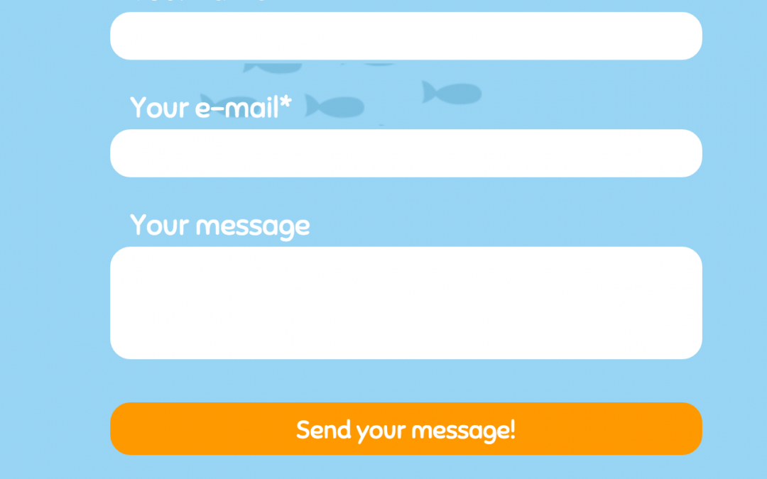
More is not better.
Contact forms can be quite complex with conditional logic, multiple fields and calls to action. Research has shown, however, that the more fields a contact form has, the higher the likelihood that users will not complete the form. The “sweet spot” for number of fields seems to be 3 – Name, Email Address and Message. As the number of fields increases, drop-off rates also increase. According to this infographic from Quickspout, conversion rates decrease by 5% for every field over 3. In this case, more is definitely not better!

Replace “submit” with an action oriented phrase
Most contact forms have “Submit” as the standard phrase on the button that the user clicks to send the completed form. Simply changing the phrase to “Click Here” can increase the likelihood of clicking by about 25% over “Submit.” In addition to dropping “Submit,” stay away from terms such as “Register” and “Download” which users view as challenging and intimidating. Try using phrases such as “Learn More,” “Let’s Get Started,” or “Show Me How” and see if you notice a difference in conversion rates.
To Captcha or Not to Capcha
Captcha forms, the little blurb at the bottom of a contact form that asks users to complete a simple math equation or verify that they are “not a robot” by clicking on a box, are pretty standard issue on modern contact forms. If you’ve ever been inundated with lots of spam email from your website, you will realize the need for a little extra human verification on the contact form. Whether or not you use a captcha is really up to you because there isn’t a real definitive answer on whether this aggravates users. What we will say though, is keep your captcha VERY simple. If you’re ever spent valuable minutes trying to decipher letters or numbers to prove that you are, in fact, human, you’ll know what we mean.